

Fed Interest Rate Decision
Everything went as expected... or did it?

Introduction
Welcome back, readers.
As 2024 winds down, so did the Fed’s final interest rate cut of the year. On December 18th, the Fed lowered the benchmark interest rate by 25 basis points, bringing it to the 4.25%-4.50% range. There wasn’t much surprise here—this is exactly what we and the market had been expecting for weeks.
So why did the markets take such a significant hit? Let’s break down some of the reasons.
Furthermore, within the next 2 days we will release an article on a stock in a very hot sector that we believe could be significantly overvalued. To find out, make sure you subscribe below.
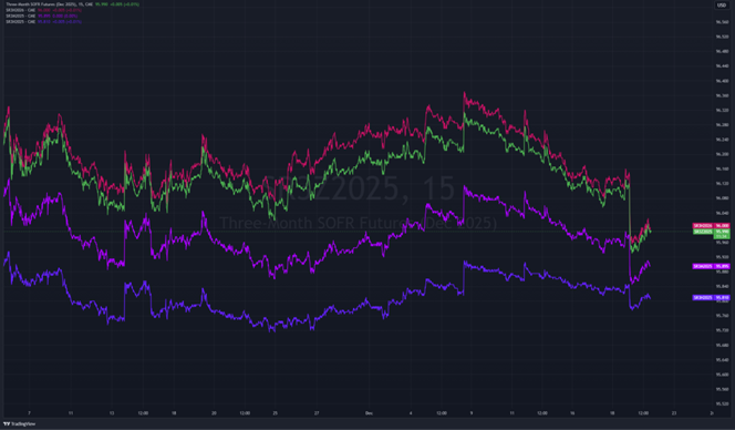
SOFR Futures and Rate Expectations
The SOFR futures chart below clearly shows how the market is reacting to the Fed’s rate cut. As rates for Dec 2025 and nearby contracts drop, it’s evident that investors are pricing in higher-for-longer interest rates. Toward the end, you can see some stabilization as the SOFRs begin to creep up again. Markets often react quickly to big events like this, and the initial adjustment makes sense. But it seems like traders may have overshot here, assuming the Fed’s new projections are set in stone, which they rarely are. A lot can happen between now and just a few months, such as the labor market starting to show cracks or inflation coming in softer than expected in the coming months.
The Fed Dot Plot: The Catalyst
The dot plot from the Fed is the clear trigger here. When you see projections for higher rates through 2025, the market had to adjust. The Fed is now expecting two cuts of 25 basis points each in 2025 - this is down from an expected cut of 100 basis points previously. That’s what’s driving this. But if you look closer, the dots narrow in later years, showing there’s less certainty further out. Despite that, the market seems to have run with the idea that rates will stay high for a long time, which might not actually happen. It’s a classic case of the market overreacting, pricing in the worst-case scenario rather than something more balanced. The Fed’s guidance caused the selloff, no doubt, but the reaction feels like it overshot.

S&P 500 Intraday TCA Index Volatility
Looking at the intraday TCA index for the S&P 500, you can tell there’s a lot of volatility. If you are not familiar with the TCA index, it is simply an index that tries to measure the dynamic in price changes. The calculation also looking at intraday volatility. The graph below is taken after market-close on December 18th and goes all the way back to December 2014. Notice how this is the second-largest decline on record? That is very telling of the overreaction the market had following the updated dot plot. It is important to keep in mind that volatility, as we saw, is usually a sign that investors are unsure and still figuring things out—not necessarily that the market is in real trouble. So, while the Fed’s update clearly shook things up, it does not justify the immediate sell-off we experienced and is likely more like short-term uncertainty driving wild swings.

Market Breadth: Cumulative TICK and Advance-Decline Line
The breadth data here is key. Cumulative TICK and the advance-decline (ADV/DECL) lines show the selling pressure was very widespread initially but started to crawl back. This suggests that the dip isn’t dragging the whole market down, just certain areas that are more sensitive to rate changes. It’s also worth noting that extreme, prolonged negative readings aren’t there. However, the significant drawdown you see in the graph below was very significant by all measures. This shows some buyers are still active, stepping in to take advantage of lower prices. This fits your view that the selloff might be exaggerated.

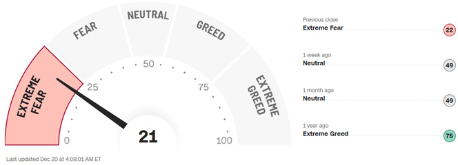
Fear and Greed Index
When we have wild events like this, it's typically a good idea to look at the Fear and Greed index. It’s deep in "Extreme Fear," which usually means investors are panicking. That swing from "Neutral" to this extreme in just a week is telling—it’s not about fundamentals, it’s about fear taking over. Historically, these kinds of sentiment extremes don’t last long. They’re often followed by stabilization or even a rebound as calmer minds step in. It seems like people may have sold off too fast, reacting to fear instead of looking at the bigger picture.
Closing thoughts
The Fed’s dot plot definitely sparked the downturn, but the data suggests the reaction might have been overblown. Breadth indicators show the selling wasn’t too broad-based, sentiment is at levels that usually mark a turning point, and the S&P’s intraday moves indicate we experienced an abnormally large downswing last week.
While the dot plot changes were significant, the market’s assumption that these higher rates will stay locked in might not hold. There’s a strong case that this dip was an overreaction and that a recovery could be on the horizon as investors step back and re-evaluate.
Furthermore, another piece of evidence suggesting the sell-off could be over—and that we might see a rebound soon—is the spread between the January and February VIX futures. Looking at the graph below, we can see that the spread went into immediate contango following the publication of the dot plot. However, once the PCE data was released on Friday, we shifted back into backwardation.
To close, I would like to wish all of you happy holidays and a prosperous 2025 for you and your family.